Showing posts with label nature. Show all posts

30 September 2016

South Side Schlumpy Funk by Laura Jean McLaughlin

About Pgh Murals
Spreadsheet of Pittsburgh Public Art and blog archives
Map of Pittsburgh Public Art

Cara and Adam Jette, members of The South Side Slopes Neighborhood Association, saw photos of some step art projects around the world and realized that they had the makings of a step art gallery in their back yard. All of the staircases peppering the Southside Slopes were blank canvases with all sorts of fun possibilities. After months of research, planning, fundraising, and collaboration with local artist Laura Jean McLaughlin, phase one of this master plan became reality.

Oakley St was chosen to be the first stairway for the artistic transformation (with the hope of doing more in the future). Before anything else could be done, the steps needed some TLC. Cara and Adam did the legwork and arranged for the city to make repairs so there would be a good foundation for the artwork.

Laura Jean McLaughlin met with the committee, the community, and the volunteers to create a design that incorporated the ideas of everyone that wanted to help. The first creative session started with everyone doing some art exercises, stimulating the creativity of the group. Then everyone was asked to contribute words or short phrases about the neighborhood.

Once the list was done, each participant was tasked with selecting three or four items from the list to put together an idea for a design. Some of the resulting proposals were very imaginative and fun! They ranged from a poem comprised using only words on the list, to a wide range of images. Many of them included elements from the history of the neighborhood. Some included images of places and things prevalent in the community today. Others creatively blended the words and ideas into eclectic images. In the end Laura Jean McLaughlin took all of the suggestions, all of the words and ideas offered, and produced two designs for the group to chose from. When the designs were presented at the following meeting the group was thrilled. The winning design was selected and a few tweaks were proposed.

From that point, Ms McLaughlin needed to create the full scale design, divide it into 77 horizontal segments, and calculate the amount of each color of tile that would be needed. It would take months to get the tile because the only manufacturer of a frost-proof tile able to endure our climate is in Italy.

The sketch had to be modified somewhat because of the unusual perspective the steps would create. Standing at the bottom and looking up would require some adjustments. Laura Jean tried to compensate for the viewing angle and the fact that each step would most likely obstruct a slice of the step above it until the viewer moved far enough back. There would still be some issues because of the landings in the long staircase, but as the viewer climbs the steps they can easily see the image unfold. One of the modifications Ms McLaughlin made was the elongated neck on the woman. As you walk up the steps it's noticeable, but from the bottom the image looks proportional.

While Ms McLaughlin worked out all of the artistic details, the committee worked on raising sufficient funds. They applied for grants, held fundraising events, and used a crowd funding website to get the donations they needed.

Once the tiles arrived, it was time to gather the volunteers together and teach them how to create the mosaic. Laura Jean McLaughlin manufactured 77 boards, each covered with the design for one of the risers on it. That was overlaid with a strip of mesh for attaching the tiles.

The volunteers were shown how to break the tile using tile nippers and attach the pieces to the mesh with just enough adhesive to hold them in place.

As the installation began, interested started to grow. Pedestrians, cyclists and motorists all paused to admire the work. Many stopped to ask about it and take some pictures. Soon we noticed photos popping up on social media and the response was very positive.

We stopped by while Laura Jean worked with an assistant to install the panels. At this point, she hadn't titled the mural, but she told us the woman in it was Darla. That much she was sure of, but the title was still being elusive. A few days later, as the installation continued, it came to Laura Jean and South Side Schlumpy Funk was named.
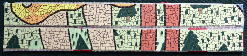
To install the mural, each strip of mesh with the tile attached was carefully cut from the wood. Another board was placed on top of the panel and the entire piece flipped upside down. Thin set mortar was then applied to the back of the tile as well as the step riser, and then the tile panel was pressed into place.

This was a pretty big project and there were a few hurdles along the way. First were the administrative hoops to jump through - getting city approval for the project; getting the art commission to ok the design; getting the steps repaired. Then there was the fundraising. This project was only possible because Laura Jean McLaughlin cut her fee to the bone. She was that excited to take this on. Thanks to her and to all the people that contributed to the Go Fund Me campaign, plus all the volunteers that worked on it - we have a really cool set of stairs in the city now.

There were a lot of volunteers that stepped up and contributed. Too many to list here. More than 40 different people showed up for the meetings and helped break and glue tiles into place. Of course there were a few college students that almost ruined it all when they took one of the steps home to work on and never returned it. Ms McLaughlin had to re-create the design for that step and Cara and Adam came through in the crunch to fill it with tiles while the other steps were being installed.

There were high hopes of having it all installed in time for Step Trek 2016, but the weather didn't cooperate. Several days of rain put things on hold and the mural was only half finished by then. It was worth the wait though. The finished mural is fun, unique, colorful and an amazing accomplishment. The community really pulled together to make this happen. Laura Jean McLaughlin not only wowed us with the design, but did a great job of leading all the volunteers through the process of bringing it to life.

Because of the location of the staircase, there was no way for us to get a good photo without the street sign obstructing part of it. Here are some close ups as you walk up the steps:

16 January 2016

East End Food Co-op mural by Brett Guerra

About Pgh Murals
Spreadsheet of Pittsburgh Public Art and blog archives
Map of Pittsburgh Public Art

The East End Food Co–Op has been around since the 1970's when it was hard to find organic, natural, healthy options in conventional grocery stores. Reading through their web site and mission statements, you know that they're all about good, wholesome, sustainable, natural foods – and this mural seems to reflect that policy.

You see an abundance of fresh fruits and vegetables growing right next to the city, which would mirror the Co–Op’s goal of buying locally grown, healthy foods as much as possible. When we contacted the artist, Mr Guerra told us all about his design:

"The process in the beginning consisted of 3 concept drawings. The good folks of the East End food co op were very diplomatic with how they decided on the final product, voting and conversing amongst their staff over a couple weeks as well as taking input from me. Their big goal was to compile the themes of city, farm/produce, and community. I am a tattoo artist by trade so flow and design is huge with me. I did two different versions with the woman as the main subject and the flowing hair amongst an abundance of produce and a city scape. The community theme fell through in the final draft just because of how busy it already was. The symbolism is pretty literal. The woman figure is painted as mother earth and has her hands around the sun which is where her heart would be, also the location of one of the chakras. It is really just a ode to the reason life exists sans any notions of intelligent design, that tends to take away from what we can absolutely determine as our source of life not to mention the sun was worshiped before anything else. As I stated before the abundance of produce and the crop field is pretty self explanatory. I wanted to have multiple field workers joined hand in hand but given winters rapid approach and the late start date due to deliberations on concepts taking so long I decided not to. The city scape as well with the two main sky scrapers of Pittsburgh in the foreground. The experience of painting the mural was awesome. I am in no way a morning person so the early starts were a welcomed change for me. I also looked forward to eating something from the buffet everyday. I don't get to eat that healthy much and just took a little of whatever was out and never was disappointed. Major props go to the cooks. All of the members and patrons who passed by as well as random city goers were very supportive and talkative. It was very refreshing to have that much human interaction and to receive a lot of great feedback including a lot of thank you's for improving the place they are so fond of.

He also wrote I would like to add everyone who worked at the co op was veeerrryyy helpful and nice, it was a great experience and made me want to live in the city more than I already do.

We think the mural adds a nice touch to an otherwise nondescript location.

10 January 2016

Urban Paradise by Gregg Valley

About Pgh Murals
Spreadsheet of Pittsburgh Public Art and blog archives
Map of Pittsburgh Public Art

Pittsburgh as Oz? My first impression of Urban Paradise, with the facetted style and the city surrounded by green, made me think of that mythical place. Maybe it was the style and colors that took my thoughts to emeralds and then to Emerald City. It’s certainly not the classic image of Pittsburgh surrounded by three rivers. In this vision there’s water in the foreground but the city is set back beyond green hills. An image of what it might be like if downtown had been the only section ever developed here. It does make you think of an idyllic spot though, with an abundance of nature everywhere you look. A very peaceful image, and that’s exactly what the local community was hoping for.

The mural is located on the side of a women’s shelter and one of the staff came out as we were admiring the mural. She explained that they had wanted an image of a calm oasis. Something to take your mind away from society and all of the stress and issues. With that for the goal, I’d have to say that Gregg Valley hit it out of the ballpark. The city is still there, yet it’s pushed out of the foreground by the calming sensation of nature enveloping you.

We found an article by Kelly Horein in the Duquesne Duke (5 Oct 2006) where Mr Valley explains a bit about the piece:

...the colorful waterfall scene depicted in the mural will bring nature into the city. He also described a unique process he used in the mural called faceting. By breaking up the colors into difference facets, he created the illusion of texture and depth in his painting.

The lush, green image also reminded me that Uptown had started a program to plant more trees in the area. The mural ties in nicely with the idea of bringing nature back into the city.

05 January 2016

Mural in a Business Park by Dwight Kirkland, Michael Colley

About Pgh Murals
Spreadsheet of Pittsburgh Public Art and blog archives
Map of Pittsburgh Public Art

This mural is at an entrance way to an industrial park in Robinson Twp. It was commissioned by the company that developed the park and painted by Dwight Kirkland of Black Leaf Studios. At 80 x 20 feet it’s an anchor for the complex and depicts Pittsburgh’s transition from steel, smoke and industry to a green city with recreation and wildlife in the rivers.


30 December 2015

Garden-themed Mural by Ashley Hodder

About Pgh Murals
Spreadsheet of Pittsburgh Public Art and blog archives
Map of Pittsburgh Public Art

Up on Mt Washington, a few blocks back from the scenic overlooks, there was a fence covered in graffiti at a troublesome intersection. Ashley Hodder was commissioned to paint a mural on this fence with the guidelines of something bright, colorful, and with a garden theme. The objective was to draw people back toward this section of the neighborhood, and at the same time eliminate the blank canvas that kept attracting the unwanted graffiti.

Ashley created a vibrant scene of poppies, bees and birds. We asked why she chose poppies and she explained how she wanted the mural to have a sensation of movement and needed a flower with a contrasting center to achieve it. She pointed out how the dark centers acted a bit like musical notes to lead your eye across the fence. In addition to that, there are bees and a bird that help to move your focus left to right. A darker band of flower buds interspersed with the blooms will then lead you back across the fence from right to left.

It's a beautiful scene and it seems to accomplish it's goal. It drew us up the street to see it and when we got there we saw a clean, landscaped intersection. No graffiti - only a great mural.