Spreadsheet of Pittsburgh Public Art and blog archives
Map of Pittsburgh Public Art
 |
| photo by Jeremy Raymer |
Jeremy Raymer pays tribute to Italian opera singer Lina Cavalieri, who was known as the
most beautiful woman in the world.
|
| photo by Jeremy Raymer |
most beautiful woman in the world.
About Pgh Murals
Spreadsheet of Pittsburgh Public Art and blog archives
Map of Pittsburgh Public Art

Sixteen wind turbines are integrated into this design to generate the power for thousands of LED lights. This eco-friendly, technology driven public art is here temporarily, making the Rachel Carson Bridge sparkle for the Christmas season. Yeah, I know, we're supposed to call it Sparkle Season
or some other euphemism, but whatever you call it, the non-denominational artwork is scheduled to be here from Light Up Night until New Year's Eve (18 Nov - 31 Dec 2016).
A computer system controls every strip of lights and can be programmed remotely. During the Light Up Night festivities we watched the light patterns changing in color and rhythm. Definitely a festive addition to the city lights.
About Pgh Murals
Spreadsheet of Pittsburgh Public Art and blog archives
Map of Pittsburgh Public Art

The Pittsburgh Cultural Trust recognized that the local bike community was growing. Bikes were being observed more and more moving through the Cultural District, but bike parking wasn’t keeping up with the increase. With insufficient bike racks, cyclists were locking to trees, parking meters, trash cans – whatever they could find.
Rather than complaining about the helter skelter lock ups, the Cultural Trust decided to kill two birds with one stone. They could add bike racks AND public art if they combined the two. A call went out for artists to design some original, functional artwork that could hold two bikes minimum, and the first five designs were chosen for phase I. At the end of August 2014, those first five art–racks were installed and the response was good. So good that a second call went out to artists for more designs that they installed in 2015.

Will Schlough designed Bicycle Bridge. He set out to build more than just a physical bridge though. His goal with this design was to build another kind of bridge. One between the (sometimes adversarial) cyclists and drivers. He said that he wanted a design that brought both sides together in their pride for this city. We do love our bridges.
Bicycle Bridge is also painted the same color as the city bridges, which (in case you’re curious) is Aztec gold
. A kind of perfect design to represent the City of Bridges
.
This particular bike rack far exceeds the requirement to hold two bikes. We think six will fit comfortably and it has a great variety of heights and angles that will accomodate pretty much every size and style of bike.

Carin Mincemoyer told us that the design for this bike rack references the symbol for a thunderstorm seen on a weather report
. She explained to us that most of her artwork involves our relationship to nature. She feels that biking changes our relationship to the environment by making us deal with the weather more directly.
. That it does.
Carin has designed other weather inspired bike racks. We found this information about her Partly Sunny, Snow, and Rain bike racks that won a similar design contest in Philadelphia.

We contacted artist Toby Fraley and he sent us the proposal that he originally submitted when the Cultural Trust put out a call to artists for the project:
My goal with this project was to not just make a bike rack, but also design a piece that could stand on it’s own as a new piece of public art for the city of Pittsburgh. The fact that it can act as a bike rack as well is an added benefit.
My bike rack concept incorporates a constant distraction of mine – contrails left behind by jet aircraft. Airliners glinting in the sun, laying white streaks across the sky have always captivated me. The way some contrails intersect on the blue canvas they fly across almost seems purposely composed by pilots unconcerned with flight destinations. Maybe I’m alone in finding those man–made intersections of white lines high above mesmerizing, but I hope not. I believe bringing them down to ground level as a piece of art may cause others to notice them more. Maybe some passersby who encounter the piece downtown will start looking up themselves, admiring the contrails above them between our city’s tall buildings.

This is the only abstract design in the first phase of Pittsburgh Cultural Trust's project. In an interview with Triblive writer Kellie Gormly, Colin Carrier said I saw the project come up, and I thought it could be kind of fun to make something blending arts with functional parameters. It was a lot of fun. I wanted to do something to really push the limits of what I can do in terms of manipulating the metal. I wanted something kind of elegant and smooth and refined and minimal.
When we asked Colin about the piece, he told us that it’s made of solid, forged steel, and that the shape was driven by its need for functionality and my own desire to use a smooth flowing line without much flourish
.

This piece was untitled, but instantly recognizable as a piece of one of our iconic bridges.

Word balloons are a recurring theme in artist John Peña's work. His 2009 mural in Lawrenceville Thoughts on a Blue Sky used them. He also did a series of three dimensional sculptures in 2016 in Buffalo, NY. Regarding that display, Mr Peña explained on his website that I wanted to explore how the act of speech has the capacity to carry a significant intellectual and emotional weight
. On the bike rack he explains: I wanted to create a functional artwork that combined preexisting elements of the city with a more playful and silly visual icon like a word balloon.
As a regular biker, I often lock my own bike up to street signs suspended with steel tubing so it made sense to use such a common material already found in the landscape. I then elevated the word balloon off of the sidewalk to try and lessen the visual and physical clutter while also directing pedestrians attention upwards to the surrounding architecture of the city.

We contacted Brandon and he told us this on the design:
"Hot Pants" was created around an idea of tracing thermal work. I used thermal imaging software to take samples of downtown Pittsburgh work (of the infrared type) near my bike rack installation site. After the initial imaging I then created a trace / drawing utilizing the heat information that I received.
I think of the bike rack as a sketch of hidden work.

We found this information about Time Travelin' Mike on the Pittsburgh Artist Registry: Start with one intriguing bit of history: the wristwatch came into being when bicyclists, unable to readily access a pocket watch while riding, began leather-strapping timepieces to their wrists. Blend in cultural influences from that same period -- Pittsburgh's rich industrial heritage, slices of Jules Verne and H.G. Wells topped off with a splash of Alice in Wonderland. Meld history, invention and fantasy with off-kilter scale and the result is Time Travelin’ Mike, named for my steelworker father to honor his creative spirit. As an artist who is passionate about place-making, my hope is to deliver public art that's ferociously fun yet functional, appealing to pedestrians and cyclists alike.

On Mr Raczka's website we found his own statement on the design: ...I sought to integrate function, aesthetics, and history. My first concern was function, with the requirements stating that it must be possible for at least 2 bicycles to be locked to it. When I can’t find a bike rack, I do what many bicyclists do: look for a sturdy fence to lock my bike to. Much of Pittsburgh was built in the late 19th and early 20th centuries and there are still a lot of iron fences around, so I thought referencing that would be a good way to acknowledge Pittsburgh’s history both in terms of the time when it developed and in terms of the city’s past as a major iron and steel producer. Taken together, I feel that those references constitute a relationship to Pittsburgh’s historical context...

This piece was inspired by the bike rides Mr Yasko took with his sons while they sang the Queen song Bicycle Race. He titled it in honor of his boys.

An obvious nod to the city's history of steel. We were unable to contact the artists or find any more information on this one.

We didn't even notice that the wheels on this were clocks until we read the article by Ed Blazina of the Post Gazette where he said: Stephen House, 30, of Highland Park designed “The Persistence of Bicycling” to show a bicycle with one wheel as a clock to highlight the different times it can take to ride a set distance depending on the terrain. Mr. House is a bicyclist and graduate student in material science engineering at the University of Pittsburgh who moved here from suburban Chicago, where almost every road is flat.

An abstract design saluting the rivers that the city is famous for. The curving lines give a sense of rolling waves while providing an interesting look which is practical and clean.
Passing this bike rack one day we noticed four bikes had locked up to it. There are so many places to thread a u-lock through, it makes it really easy to work with all different bike sizes and styles.

We've found no additional information on this one and have not been able to contact the artist.

This is actually the second bike rack in the cultural district that Mr Marshall has had a hand in. In the first phase of these bike racks, he helped with the fabrication of his wife's design Lightening Cloud listed above.

David Calfo describes himself as a salvage artist. We haven't been able to confirm if this piece was manufactured specifically for this design or if it was, in fact, created from salvaged pieces he had on hand.
As long as we were documenting all of these artist designed bike racks we thought we should mention others scattered around town.

These are the bike racks that you see all over the city. About perfect in their simplicity, the design reflects the basic design of the city itself - at the confluence of the three rivers. You can thank Bike Pgh for getting them for us back in 2004. They pushed to get city approval for them and found the funding so it wouldn't cost the city or local businesses. Thanks, Bike Pgh! And that's a bike lock hanging on this one in Lawrenceville.

Also made at Red Star Iron Works, this book design first showed up at Millvale's public library. After that the town apparently adopted the design and placed more of them around the business district.

We don't have information on the origin for this one yet. We found it (where else?) in Squirrel Hill!
About Pgh Murals
Spreadsheet of Pittsburgh Public Art and blog archives
Map of Pittsburgh Public Art

Pittsburgh has, and has had, some wonderful bridges. Every time we bike across the 16th St Bridge I can't help admire the artwork high above. New bridges just don't get the funding for such fabulous, decorative additions. Back in 1917 they did, and the old Manchester bridge had some wonderful adornments on either end. When the bridge was demolished in 1970 the bronze sculptures were saved. They spent some time on the North Side and then disappeared from public view for many years, but in 2016 this end of the old bridge was placed back out in the public eye.


The images of 18th century guide Christopher Gist, Seneca leader Guyasuta, and the city of Pittsburgh's coat of arms have been installed near the spot where they originally were. Across the street from this installation you can see the old support pier from the Manchester Bridge - now integrated into A Tribute to Children (AKA the Mr Rogers
sculpture).

About Pgh Murals
Spreadsheet of Pittsburgh Public Art and blog archives
Map of Pittsburgh Public Art
The Pittsburgh Downtown Partnership (PDP) has been working since 2003 to improve the environment of this alley that connects Liberty Ave to Grant St. Heavy pedestrian use has inspired the PDP and local businesses to turn it into an inviting, pedestrian-only area. Over the years there have been some smaller art installations, but starting in 2016, they went big. The entire three block stretch of pavement is now covered with a mural. The art is temporary and the plan is to replace it with something new every few years.

According to the Office of Public Art, Mance’s mural design was influenced by the surrounding architecture in Strawberry Way and the region’s curvaceous topography.


Cara and Adam Jette, members of The South Side Slopes Neighborhood Association, saw photos of some step art projects around the world and realized that they had the makings of a step art gallery in their back yard. All of the staircases peppering the Southside Slopes were blank canvases with all sorts of fun possibilities. After months of research, planning, fundraising, and collaboration with local artist Laura Jean McLaughlin, phase one of this master plan became reality.
Oakley St was chosen to be the first stairway for the artistic transformation (with the hope of doing more in the future). Before anything else could be done, the steps needed some TLC. Cara and Adam did the legwork and arranged for the city to make repairs so there would be a good foundation for the artwork.

Laura Jean McLaughlin met with the committee, the community, and the volunteers to create a design that incorporated the ideas of everyone that wanted to help. The first creative session started with everyone doing some art exercises, stimulating the creativity of the group. Then everyone was asked to contribute words or short phrases about the neighborhood.
Once the list was done, each participant was tasked with selecting three or four items from the list to put together an idea for a design. Some of the resulting proposals were very imaginative and fun! They ranged from a poem comprised using only words on the list, to a wide range of images. Many of them included elements from the history of the neighborhood. Some included images of places and things prevalent in the community today. Others creatively blended the words and ideas into eclectic images. In the end Laura Jean McLaughlin took all of the suggestions, all of the words and ideas offered, and produced two designs for the group to chose from. When the designs were presented at the following meeting the group was thrilled. The winning design was selected and a few tweaks were proposed.

From that point, Ms McLaughlin needed to create the full scale design, divide it into 77 horizontal segments, and calculate the amount of each color of tile that would be needed. It would take months to get the tile because the only manufacturer of a frost-proof tile able to endure our climate is in Italy.

The sketch had to be modified somewhat because of the unusual perspective the steps would create. Standing at the bottom and looking up would require some adjustments. Laura Jean tried to compensate for the viewing angle and the fact that each step would most likely obstruct a slice of the step above it until the viewer moved far enough back. There would still be some issues because of the landings in the long staircase, but as the viewer climbs the steps they can easily see the image unfold. One of the modifications Ms McLaughlin made was the elongated neck on the woman. As you walk up the steps it's noticeable, but from the bottom the image looks proportional.
While Ms McLaughlin worked out all of the artistic details, the committee worked on raising sufficient funds. They applied for grants, held fundraising events, and used a crowd funding website to get the donations they needed.
Once the tiles arrived, it was time to gather the volunteers together and teach them how to create the mosaic. Laura Jean McLaughlin manufactured 77 boards, each covered with the design for one of the risers on it. That was overlaid with a strip of mesh for attaching the tiles.


The volunteers were shown how to break the tile using tile nippers and attach the pieces to the mesh with just enough adhesive to hold them in place.

As the installation began, interested started to grow. Pedestrians, cyclists and motorists all paused to admire the work. Many stopped to ask about it and take some pictures. Soon we noticed photos popping up on social media and the response was very positive.


We stopped by while Laura Jean worked with an assistant to install the panels. At this point, she hadn't titled the mural, but she told us the woman in it was Darla. That much she was sure of, but the title was still being elusive. A few days later, as the installation continued, it came to Laura Jean and South Side Schlumpy Funk was named.
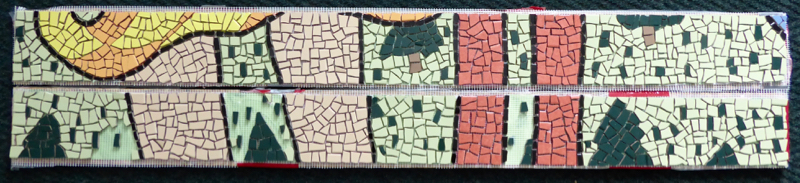
To install the mural, each strip of mesh with the tile attached was carefully cut from the wood. Another board was placed on top of the panel and the entire piece flipped upside down. Thin set mortar was then applied to the back of the tile as well as the step riser, and then the tile panel was pressed into place.
This was a pretty big project and there were a few hurdles along the way. First were the administrative hoops to jump through - getting city approval for the project; getting the art commission to ok the design; getting the steps repaired. Then there was the fundraising. This project was only possible because Laura Jean McLaughlin cut her fee to the bone. She was that excited to take this on. Thanks to her and to all the people that contributed to the Go Fund Me campaign, plus all the volunteers that worked on it - we have a really cool set of stairs in the city now.
There were a lot of volunteers that stepped up and contributed. Too many to list here. More than 40 different people showed up for the meetings and helped break and glue tiles into place. Of course there were a few college students that almost ruined it all when they took one of the steps home to work on and never returned it. Ms McLaughlin had to re-create the design for that step and Cara and Adam came through in the crunch to fill it with tiles while the other steps were being installed.
There were high hopes of having it all installed in time for Step Trek 2016, but the weather didn't cooperate. Several days of rain put things on hold and the mural was only half finished by then. It was worth the wait though. The finished mural is fun, unique, colorful and an amazing accomplishment. The community really pulled together to make this happen. Laura Jean McLaughlin not only wowed us with the design, but did a great job of leading all the volunteers through the process of bringing it to life.

Because of the location of the staircase, there was no way for us to get a good photo without the street sign obstructing part of it. Here are some close ups as you walk up the steps:


About Pgh Murals
Spreadsheet of Pittsburgh Public Art and blog archives
Map of Pittsburgh Public Art

The Forks is owned by the Carnegie Museum of Art. The Smithsonian includes this description of the piece in its Collections Search:
Silver–colored aluminum abstract piece meant to symbolize the area known asthe fork of the Ohiowhere Pittsburgh had its beginnings. Pittsburgh was founded at the convergence of the Ohio, Allegheny, and Monongahela rivers and later flourished as a vital industrial region. This sculpture is formed in welded, cast aluminum to produce a structure that reflects the force of the rivers and the metal industries it generated.

This 14 foot high sculpture was originally commissioned by the Alcoa Foundation for Allegheny Landing Sculpture Park. When the park was designed in 1983, the designated theme for the artwork was labor and industry. The Post Gazette art critic Donald Miller described the piece as suggesting molten metal
, which represents the city’s industrial heritage well.
